// recent entries
-
 Mar 9, 2026I was a bit late to the Claude Code party, and started about six months after most of my friends. I openly admit I was pretty hesitant that AI had any shot at taking over coding, but it's slowly won me over in the last few months. Like most people, I used it at first a bit tepidly, not entirely sure of it's strengths or its weaknesses. Slowly over the first few weeks I started being able to produce decent code consistently, so I thought I should experiment with it a bit more. I started on the $20/mo plan just to get my feet wet. That's great for small code changes but you quickly run into limits. ...read more: My First Week Making Hot Dogs With Claude Code Max 20
 -
 Mar 6, 2026I've been experimenting with AI-assisted development tools for the last couple of weeks, and Claude Code has pretty much become a permanent fixture in my workflow at this point. I've been testing a few different scenarios with running it - one on my local machine, and another running Claude on my Arch Linux server back in my office. I tend to work on multiple projects during the same day, so finding a solution that worked for both was what I was after. I trialed a lot of different shells and connection tools, but finally found a group of tools that I think works pretty well for me, so I wanted ...read more: My Claude Code Setup For Remote Development
 -
 Dec 25, 2024I set out last week to try and build a bare-bones repository of WordPress plugins and themes and an associated management plugin. For the most part, I think I managed to get done what I wanted, although I still haven't started the actual update mechanism for it. There are already great Github updaters, including Github Updater and Repoman. But at some point I want to add the ability to verify cryptographically signed ZIP archives, and that will require some code on the client site. But the results of that marathon coding session are now available online at The Not WP Repository. Juniper/Author The ...read more: Juniper: An Update On A New Repository For WordPress
 -
 Dec 20, 2024As most people in the community know, over the last few months things have pretty much gone to shit in WordPress-land. Every time you think it can't get any worse, it somehow manages to. WP Engine won their preliminary injunction against Automattic and Matt Mullenweg, which meant that about a week ago, the status quo was mostly put back in place - that meant, amongst other things, the Advanced Custom Fields plugin was returned to its rightful owner, WP Engine, and the loyalty checkbox on WordPress.org was removed (and then strangely replaced with a pineapple on pizza pledge box instead). Most ...read more: Juniper: A New Update Mechanism For WordPress Add-ons
 -
 Nov 8, 2024A few weeks ago, I sat down with my WordPress installation to see how difficult it would be to actually use a different API endpoint entirely instead of the default WordPress.org site. As others have pointed out, there are roughly 1,500 hard-coded WordPress.org links throughout the code, pointing to various API endpoints and reference documentation. What I discovered is, despite what some people are parading online, that there is no real easy way via the code to swap out the API entirely. In fact, the HTTP API within WordPress is probably one of the least useful APIs in terms of being able to ...read more: Down The Rabbit Hole - A Look At The WordPress Update API
 -
 Nov 2, 2024I posted the other day about how, after 18 years of WordPress, I finally migrated this blog to another framework. While I started evaluating various popular frameworks like Astro and Hugo, I had some initial problems handling the type of content I had added to my website over time. Eighteen years is a long time to be writing, and WordPress itself changed quite a bit over that period of time. For example, much of my older content has various short codes intermixed within it, which doesn’t really translate well to a new system. Considering I have a bit of time on my hands while I visit some family ...read more: Migrating Away From WordPress, Part One: Exporting Data
 -

-
 Nov 1, 2024This is my first post in a long time, as you can tell. One of the reasons I'm writing an entry is due to what's been going on in the WordPress world. In case you've been living under a rock, there is currently a big public battle going on between Matt Mullenweg, the company he runs, 'Automattic', and a rival called WP Engine. I can only speculate as to the real reasons for this public spat. On its surface, one side claims it's about a trademark dispute. But based on the actions of that same side, it seems to be some poorly thought out plan to exert more control over the community, and to attempt ...read more: WordPress Is On Dangerous Ground
 -
 Jan 8, 2022Stock is one of those things that seemed magical before I made it. I had purchased a few cooking books, and many recipes said to use ‘vegetable stock’, ‘chicken stock’, ‘beef stock’, or ‘fish stock’. At that time I was used to buying bouillon cubes to take the place of stock, but decided at some point to try making a homemade stock. Not only is making stock at home easy, but it’s a simple way to use up leftover pieces of vegetables and bones. I’ve grown accustomed now to making a chicken dinner on the weekend, and immediately afterwards putting the left over pieces into the pressure cooker to ...read more: How To Make Homemade Chicken Stock
 -
 Jun 17, 2021The Italian Mountain range known as the Dolomites is famously home to several amazing long distance thru hikes known as the Alta Vias, the High Routes. Many of these are old trails from World War I, complete with Via Ferratas, difficult stretches of climbing where a person needs to physically link themselves to metal guide wires. It’s been on my wishlist for a few years now to actually walk one of these routes, and I may finally have the chance. A few months ago I started planning to do one of long distance hikes in Italy this summer. At the time, I wasn’t sure if the situation in Europe would ...read more: Getting Ready To Walk Alta Via 2 In Italy
 -
 May 2, 2021With the COVID19 state of alarm shortly ending here in Spain, I’ve been slowly getting myself ready to do some long distance hiking. My original plan, before COVID19 hit the world, was to hopefully make it to Italy in the summer of 2021 to do a 10 day hike through the mountains. Whether or not that happens this summer is anyone’s guess, but I’m still going to act like it may happen, which means I need to start training for a high-altitude hike in the mountains. For the last month or so I have been trying to hike 15-20km of the Camino de Levante every week or two just outside of Valencia to get ...read more: Preparing For The Camino Del Norte
 -
 Feb 21, 2021I was looking through some of my old posts recently, particularly with regards to COVID-19 and the first lockdown here in Spain, and realized I hadn’t done an update in a while. Strangely, it’s going on the one year anniversary from when this all started. I had friends visiting from Canada when this all began, and as each day went by more and more activities were suspended in Spain. The first inkling of trouble was that the tickets we had to a futbol match here in Valencia were ultimately cancelled. Thinking nothing of it, we decided to purchase other tickets to see Madrid play, and those too ...read more: The Year The Earth Stood Still
 -
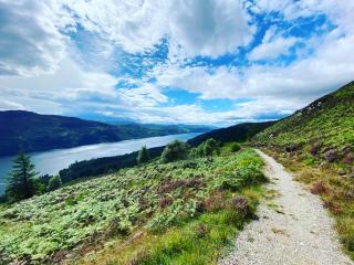 Feb 8, 2021This last weekend I finally got around to writing up my trip report for my hike along the West Highland Way in 2018. Now that that’s out of the way, I’m thankful I can finally get around to posting my thoughts on the Great Glen Way. The Great Glen Way for all intents and purposes can almost be looked at as the second half of the West Highland Way (WHW). While the WHW finishes in Fort William, the Great Glen Way literally starts where it leaves off. After I finished the WHW, my friend Tony and I took the train to Edinburgh to relax for a few days. Heading back to the Great Glen Way was essentially ...read more: Walking The Great Glen Way In Scotland
 -
 Feb 7, 2021While I’ve done my fair share of hiking in my life, as I’ve gotten older I’ve gravitated more towards multi-day hikes rather than single day hikes. I certainly enjoy an afternoon hike on a weekend, but there’s something magical (and inherently challenging) about hiking for days or weeks at a time. In 2017 I did my longest hike yet – the Camino de Santiago in Spain. I spent 28 days walking from St. Jean Pied de Port, France, to Santiago de Compostela, Spain, a distance of roughly 800km. When it was over, as I hobbled around Santiago de Compostela letting my feet heal, I told myself that my days ...read more: Walking The West Highland Way In Scotland
 -
 Sep 16, 2020I realized this morning that I haven’t really given an update since I was smack-dab in the middle of our lockdown here in Spain. Most of us here spent 98 days essentially locked up in our apartments, only venturing outside to quickly get some groceries or to go to a pharmacy. It was one of the most intense and invasive lockdowns of any country anywhere, and many people here really struggled to cope with it. While I didn’t mind being at home, especially since I had many renovation projects on the go, the inability to even go for a walk or to get exercise was really difficult mentally, and most ...read more: A Lullaby For The Old World Order
 -
 Apr 2, 2020Tomorrow marks the end of the third week of forced quarantine here in Spain, and unfortunately at this point there still is no end in sight. At the start of this week both the active cases of COVID-19 as well as the number of deaths seemed to be on the cusp of plateauing, but yesterday brought new highs for both. I normally try to stay up each night until midnight, mostly to see what the latest numbers are – while they aren’t complete, usually there is an update shortly after midnight that gives some indication of what the next day may look like. And so far many of those updates haven’t been very ...read more: Spanish Quarantine: Day 20
 -
 Mar 25, 2020This morning I woke up and like most days since the quarantine started here in Spain, immediately checked the official statistics to see if the curve has started to flatten yet. Today’s update shows rough 5,500 new cases since yesterday with another 443 people having died. roughly the entire capacity of Surrey Memorial Hospital back home in the Fraser Valley. While these numbers are slightly less than the ones from the day before, I’ve learned not to get too excited with a low day on the charts since often the next day more than makes up for it. What these numbers mean, besides the obvious horridness ...read more: Spanish Quarantine: Day 12
 -
 Mar 22, 2020On January 7th, 2020, I was on an airplane flying from Vancouver, Canada, to Spain, fully unaware of what was occurring in Asia with regards to a novel coronavirus, now known as COVID-19. Little did I know, in roughly two months we would be on lockdown here in Spain for the foreseeable future in an effort to curb the rapidly increasing countrywide death rate associated with COVID-19. Like many countries who now find themselves in a similar place, Spain mostly ignored the lessons we should have learned from Italy, and Italy largely ignored the lessons they should have learned from China. The end ...read more: Solidarity In A Time Of Crisis
 -
 Nov 19, 2019There is great deal of evidence to show that our guts used to be in a much healthier state decades ago. For example, the Hadza in Africa, one of the last ‘hunter-gatherer’ species on the planet, appear to have 300% more bacteria in their guts than we do. It seems that over time we have lost many of these bacteria, and whatever functions they once provided. In terms of gut health, one metric that’s often used is diversity. Similar to the environment, it’s often thought that the health of any ecosystem is related to the number of species in it and their relative abundance. Harmony is basically where ...read more: How We Wrecked Our Guts
 -
 Nov 19, 2019Years ago, when looking for a way to do local WordPress development, I eventually stumbled upon a pretty nifty tool called MAMP. MAMP stands for “Mac/Apache/MySQL/PHP”, and it’s the Macintosh equivalent of the well-known Linux-based LAMP stack. While you can configure MAMP by editing configuration files, I decided to upgrade to MAMP Pro, as it gives you an easier UI to use when managing some of your local websites. Despite MAMP ‘mostly working’, it has a number of really annoying downsides as well: MAMP Pro is paid software, but despite buying it multiple times, I don’t really feel like I’ve ...read more: Local WordPress Development: From MAMP to Local by Flywheel