Working On The New Theme
I had a bit of time yesterday (really, I didn’t, but the creative juices were flowing and I wanted to start dabbling), so I started tinkering with some ideas for a new theme for this site. While I routinely update the theme on this site (I average about every four months or so), I really want the next one to be up here for quite some time, so I’m not going to rush development on it.
I have a few basic goals for the new theme:
- The theme should put more focus on aspects of my life such as photography, and less on my other content
- The theme will focus more on my life, and some of my passions (such as blogging and WordPress development), and less on random blog entries about nothing
- The theme will basically update itself from third party services
I’m debating deleting a really large chunk of content from my current site. Some people will say that’s stupid from a search engine or SEO perspective, but I really think some of those entries (and the traffic they generate) don’t really lead to any useful traffic. For example, if someone gets to my site looking for a JPG of the Kool Aid jug, it’s not really that likely they’re going to want to read about WordPress or current events.
I’d like to only have four or five main categories on my site — currently I have about 20 I think. Unfortunately too, I think I installed a version of WordPress a year or so ago where the taxonomy system wasn’t completely cooked, and a lot of my tags are messed (lots have hyphens instead of spaces for example). So part of me wants to kind of start over and fix all of that. I haven’t thought it through very far yet, so I need to think about it a bit longer.
I’d really like to spend more time taking photos in the future, and I think if my blog were more photo-centric I’d be inspired to post more photos. I’ve actually sat down a few times to do a photo-centric site, but I’ve always had problems making it work. For one, photos are usually either landscape or portrait. From a design perspective, that gets a bit clunky, especially since several portrait oriented photos can have completely different aspect ratios. I might end up writing some PHP code to letter box photos such that they’re all the same size, but I haven’t made it that far yet. Since photos look brighter and more colourful when shown on a black background (the same way a stereo sounds “better” when it’s louder), I’ve made the new version have a dark background instead of the white I’ve used a few times in a row.
I started working on version two of my Crossroads plugin a few months ago. Crossroads was a pretty popular plugin for people wanting to put Flickr photos on their websites. Unfortunately, I never spent a lot of time improving it, so it’s kind of rotted on the sidelines. So version two was meant to be a pretty substantial improvement, especially since I’m also adding support for SmugMug. The good news is that Crossroads 2.0 already interfaces quite well with Flickr, so I’ve been extending it to do most of the heavy lifting on my site.
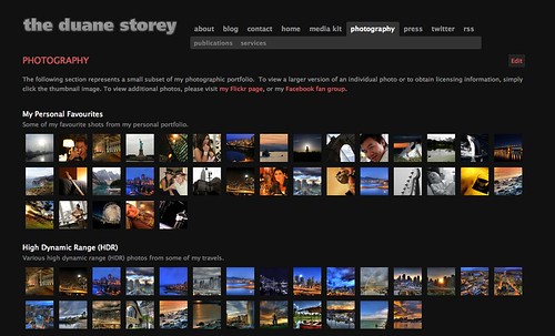
I’ve created a photography section of my site that basically shows all the photos and sets from a Flickr collection. It looks sort of like the following image:

If you want to see a live demo, head over to the demo site and check it out.
With this setup, I can basically just upload photos to Flickr, but them in the appropriate sets with the proper descriptions, and my site will automatically update itself. I’ve also created a special page for viewing each individual image (where in the past I would have just redirected people to Flickr). This method actually has several advantages. First, the verbiage and those images will essentially reside on my site, and not on Flickr. Given that my website has more Google juice than my Flickr stream, in theory I should start getting a lot more traffic based on my photos. I’ve also made the theme CC license aware, such that the proper form of attribution along with a link to the associated license is displayed under each photo. I’ve always liked EXIF information, so that’s included as well. If you want to see an example, head on over here.
Lots of designers use Photoshop. Unfortunately, I’m sort of Photoshoptarded, so I don’t really use it that often. So when I design a theme, I usually just start hacking out ideas using PHP and CSS, and slowly refine them with each iteration. So undoubtedly what I’m working on will end up being different than what I’ve started putting together, but at this point I’m just trying to flesh out the functionality.
I’m really not sure the best way to integrate Twitter at this point. Given the amount of Tweets I do in a typical day, it’s really not very useful to have them in a list anywhere. I might figure out a way to do something with the Twitter favourite system and have only those Tweets shown somewhere. I’m also probably going to put some type of FriendFeed or LifeStream on my main page, such that it represents a snapshot of everything I’ve been doing. I’d also like to find a way to merge Flickr and SmugMug, such that someone viewing a Flickr photo would be presented with a “Buy Photo” which would redirect them to the same photo on SmugMug. I’m pretty sure I can come up with some clever tagging system to make that work.
Anyways, that’s my little project for July.